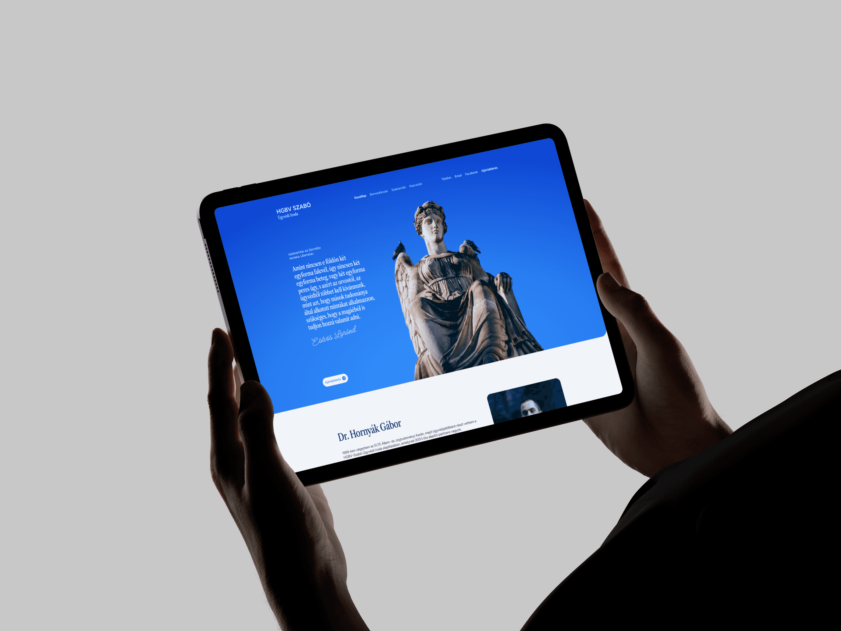
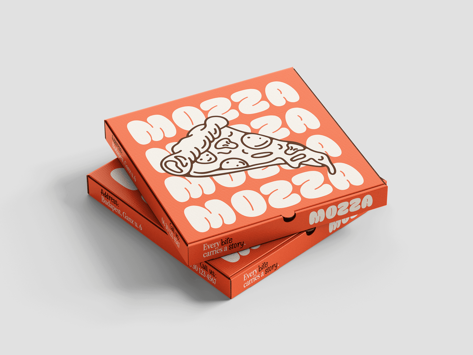
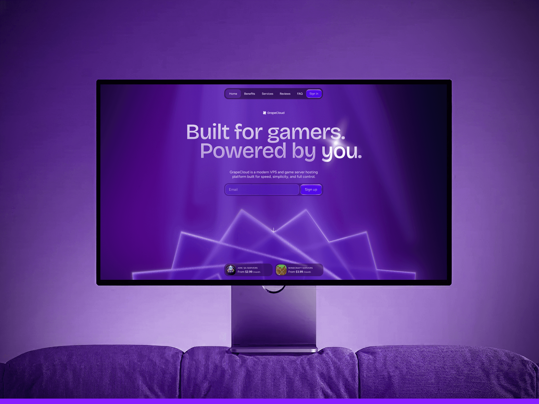
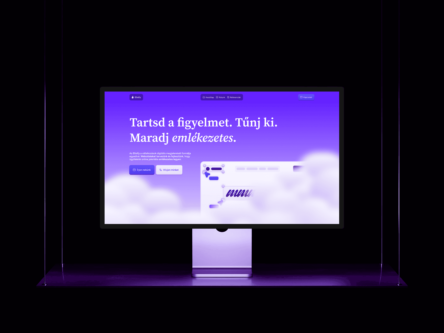
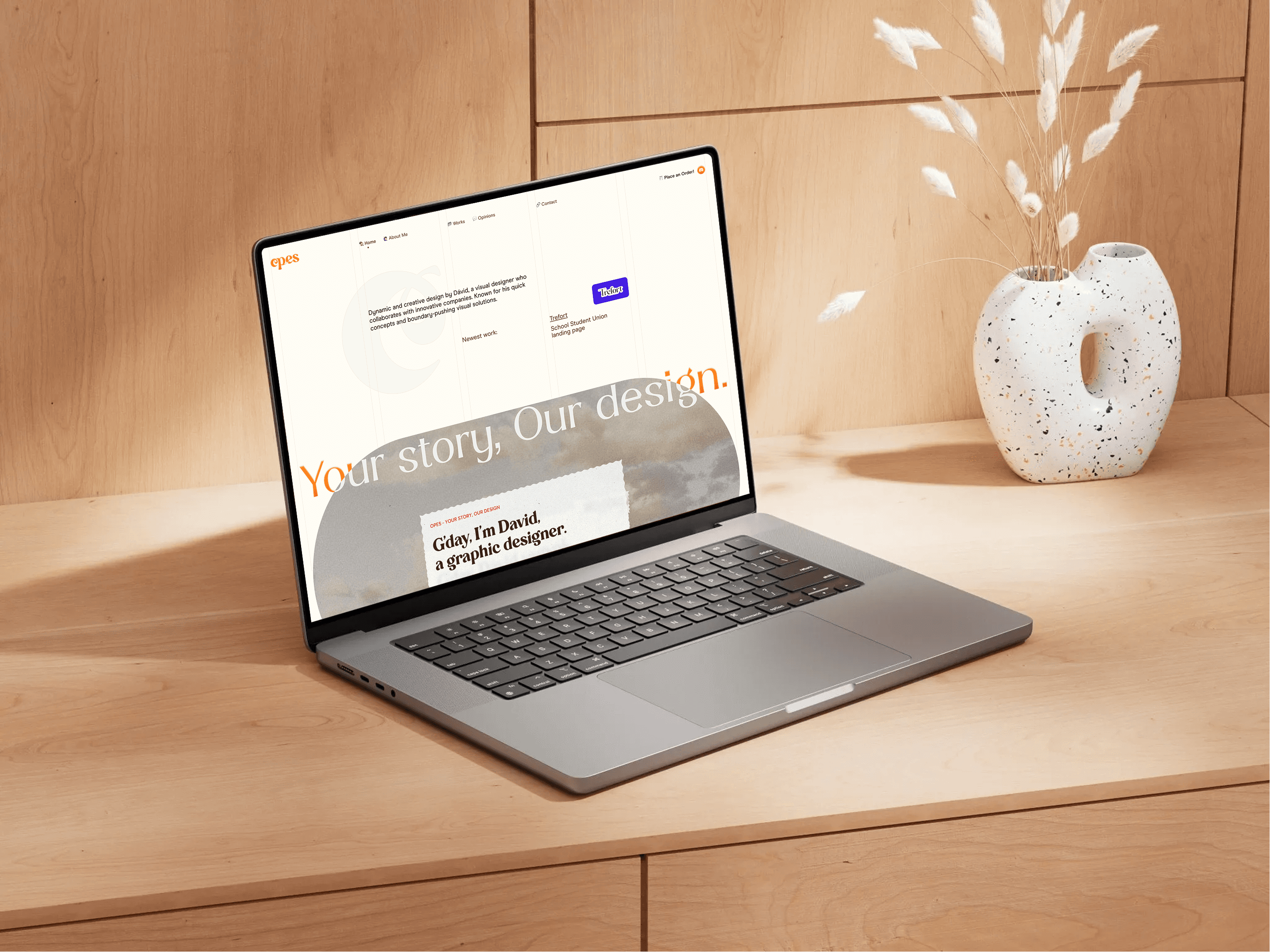
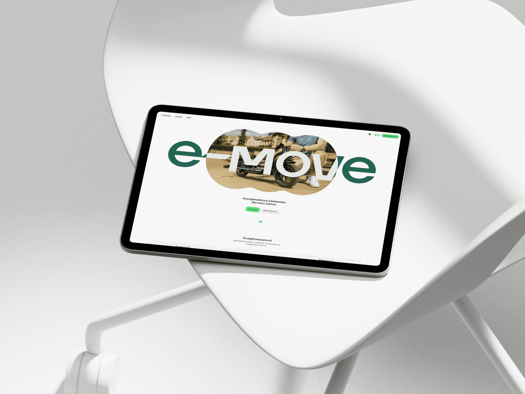
Opes was the name I used throughout 2024 and 2025 to signal a major shift in my work. While the style was a departure for me, the name perfectly captured the designer I was becoming during those two years.
As my freelance work evolved into more complex UI/UX and branding projects for startups, my previous personal identity no longer reflected my capabilities. The challenge was to create a fresh, distinct brand that could act as a professional umbrella for my growing portfolio and visually communicate a major strategic shift in my creative direction.

To ensure the new brand felt authentically me, I rooted the design process in storytelling, guided by the core principle: "Your story, Our design." I wanted the visual system to strike a balance between professional polish and a highly approachable, warm energy.
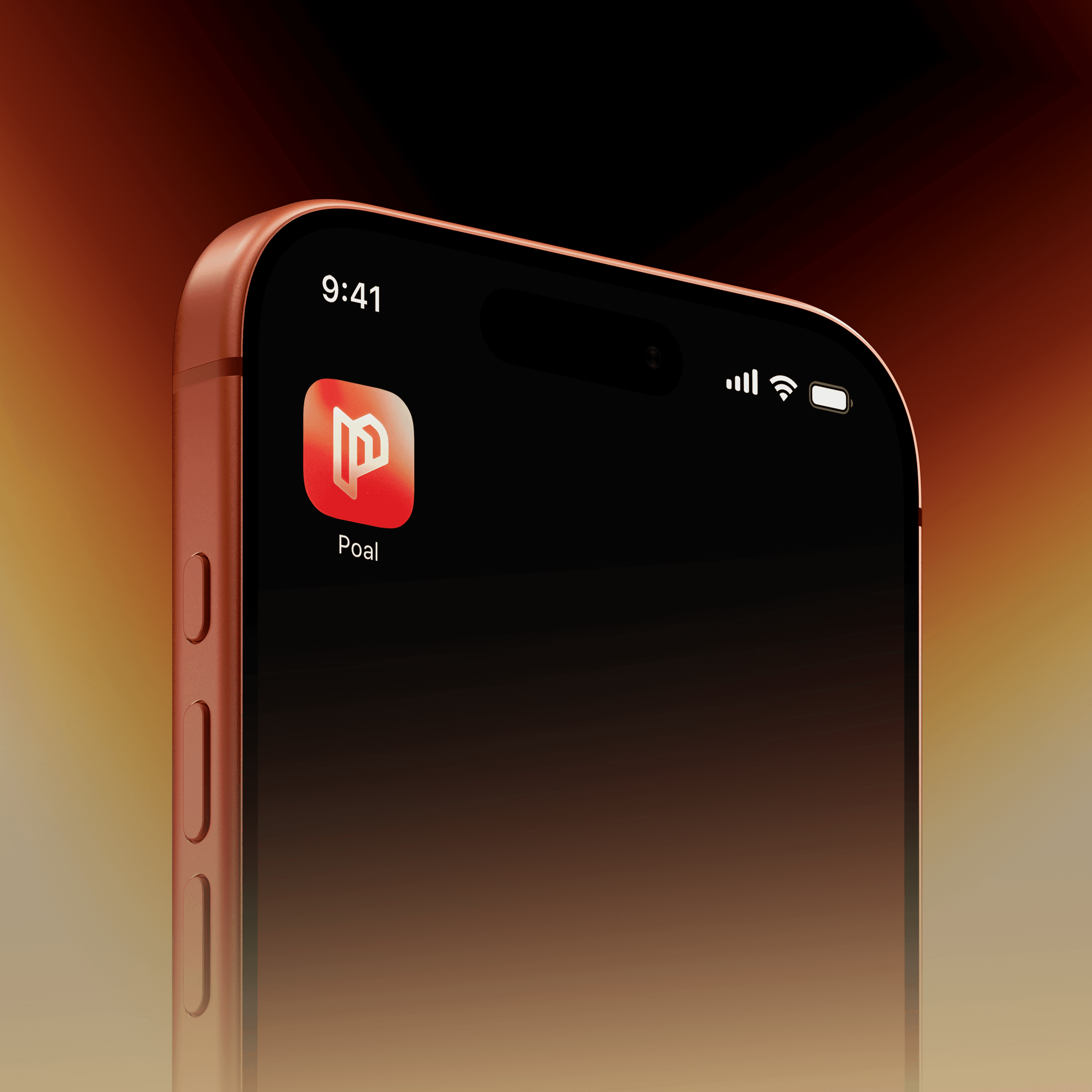
I started by customizing the Carena typeface, modifying its structure to create a dynamic, unique logotype. To inject a sense of positivity and forward momentum, I anchored the branding with a vibrant yellow-orange gradient. For the typography system, I deliberately contrasted two very different fonts: Modern Era for clean, modern readability across the UI, and Amphora to add a layer of creative personality. Every detail was consciously curated to reflect exactly where I was heading as a designer.
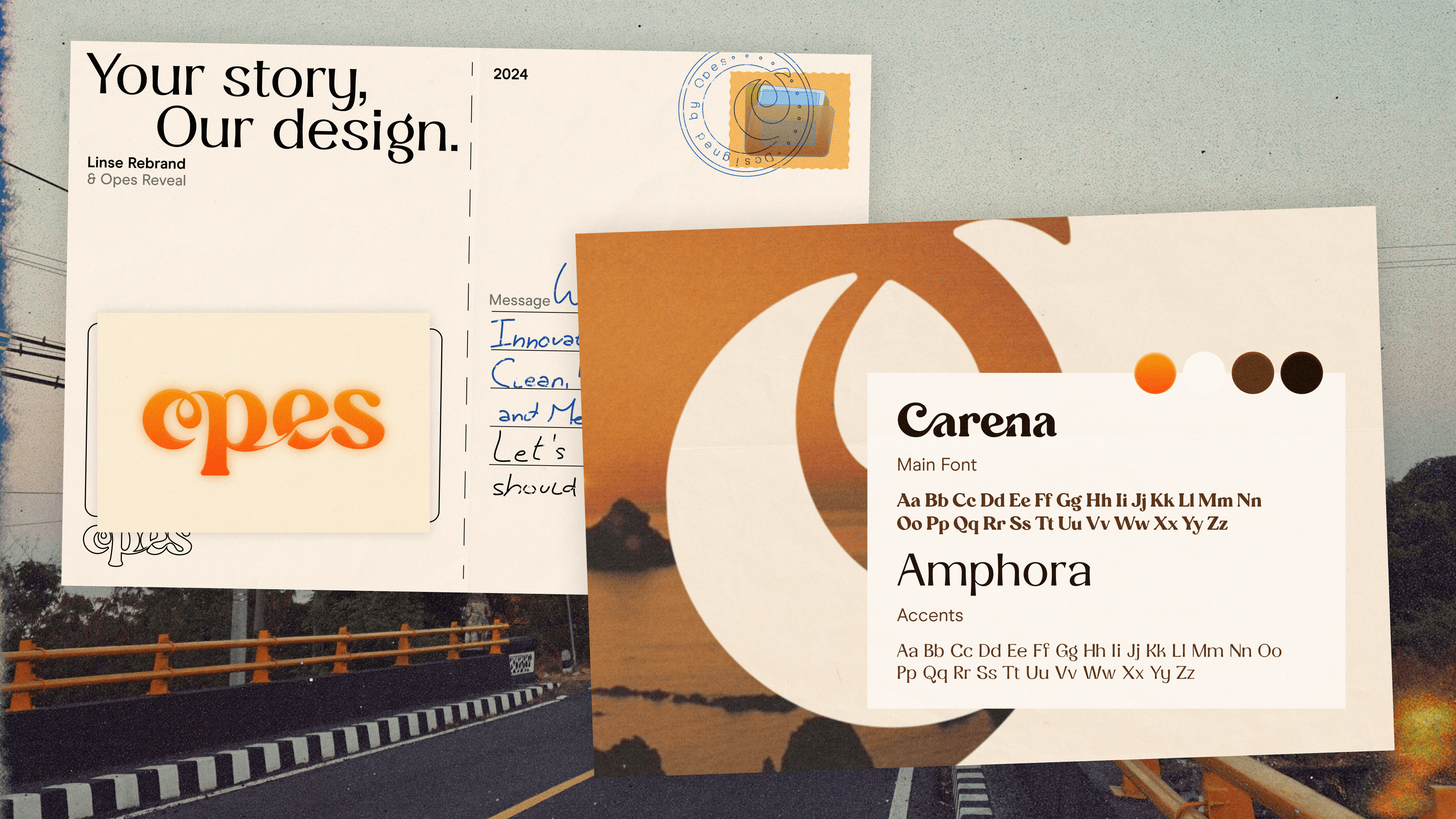

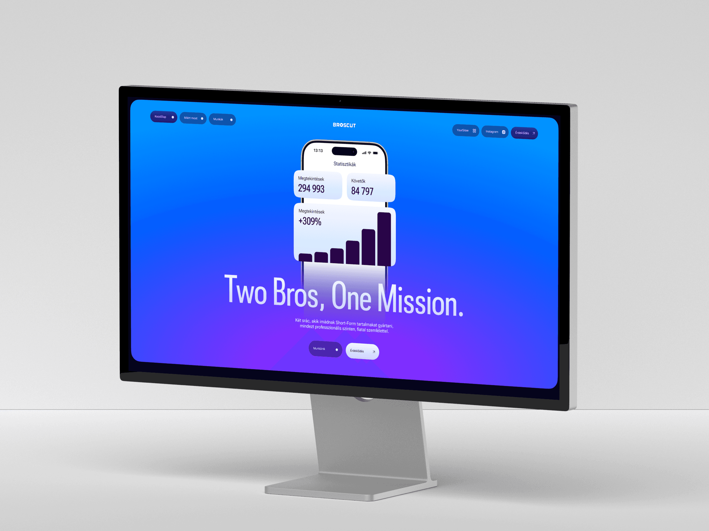
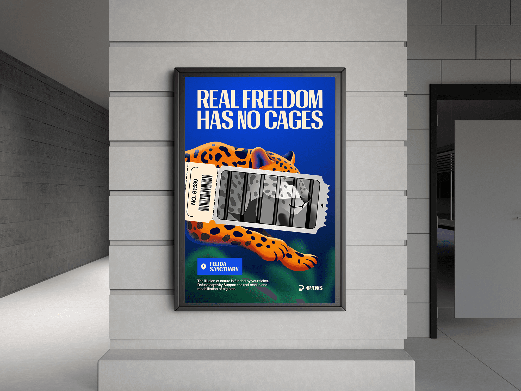
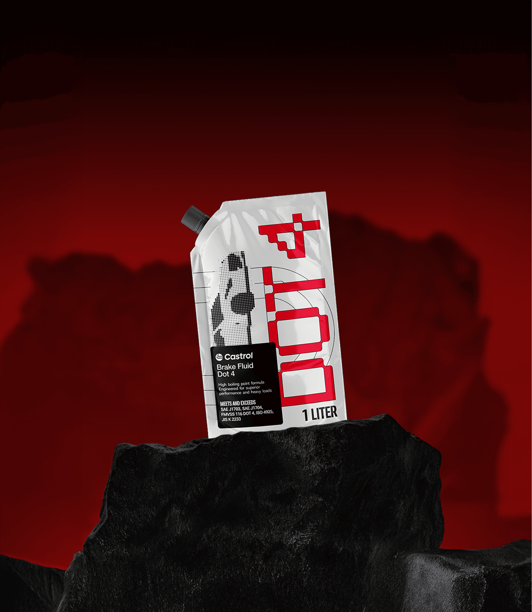
I developed "Opes," a complete brand identity and portfolio platform. I designed a cohesive visual system featuring a custom logotype, a warm and modern color palette, and an intuitive web interface to showcase my case studies. This focused digital presence successfully unified my startup projects and established a bold, mature foundation for my next career steps.