Founded as an independent, bootstrapped startup, YourSitee is an innovative link-in-bio platform leveraging AI and dynamic widgets to revolutionize how brands and individuals centralize their online presence.

As YourSitee grew, its branding no longer reflected the quality of the product. The platform had evolved into a flexible, widget-based experience, but its identity was still built around a generic stock icon that had originally been used as a placeholder. It lacked personality, wasn't memorable, and didn't feel like a product people could trust.
The goal was to create a visual identity that felt original without becoming overdesigned. It needed to appeal to creators, professionals and businesses alike while giving the product a stronger presence across the website, social media and future marketing.

The biggest inspiration came from the product itself.
Unlike traditional link-in-bio tools that are essentially just lists of buttons, YourSitee is built around modular widgets that users can freely arrange. I wanted the branding to reflect that same idea of flexibility and connection instead of relying on the usual chain-link or globe metaphors.
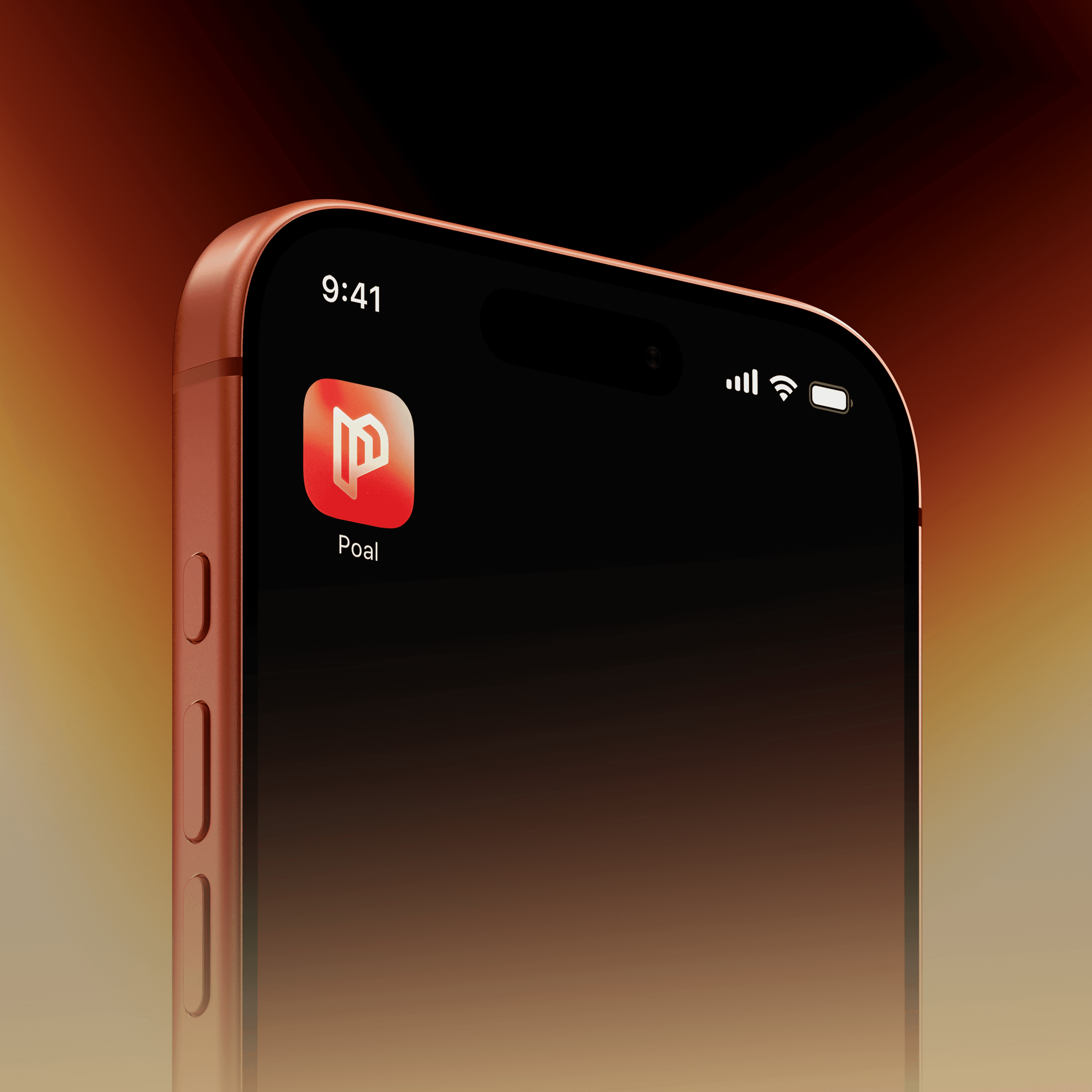
The logo was designed as a custom mark made from two interconnected shapes that can be interpreted in multiple ways. Depending on how you look at it, it suggests connection, movement, conversation and modularity without forcing a single meaning. That ambiguity made it feel much more ownable than a literal icon.
To support the identity, I paired the logo with Bricolage Grotesque, whose soft geometry complements the rounded logo while still feeling contemporary and confident. A vibrant electric blue became the primary brand color, supported by lighter blues, deep navy and a subtle purple accent. The palette gives the brand enough energy to stand out while remaining clean enough to let the product interface stay in focus.
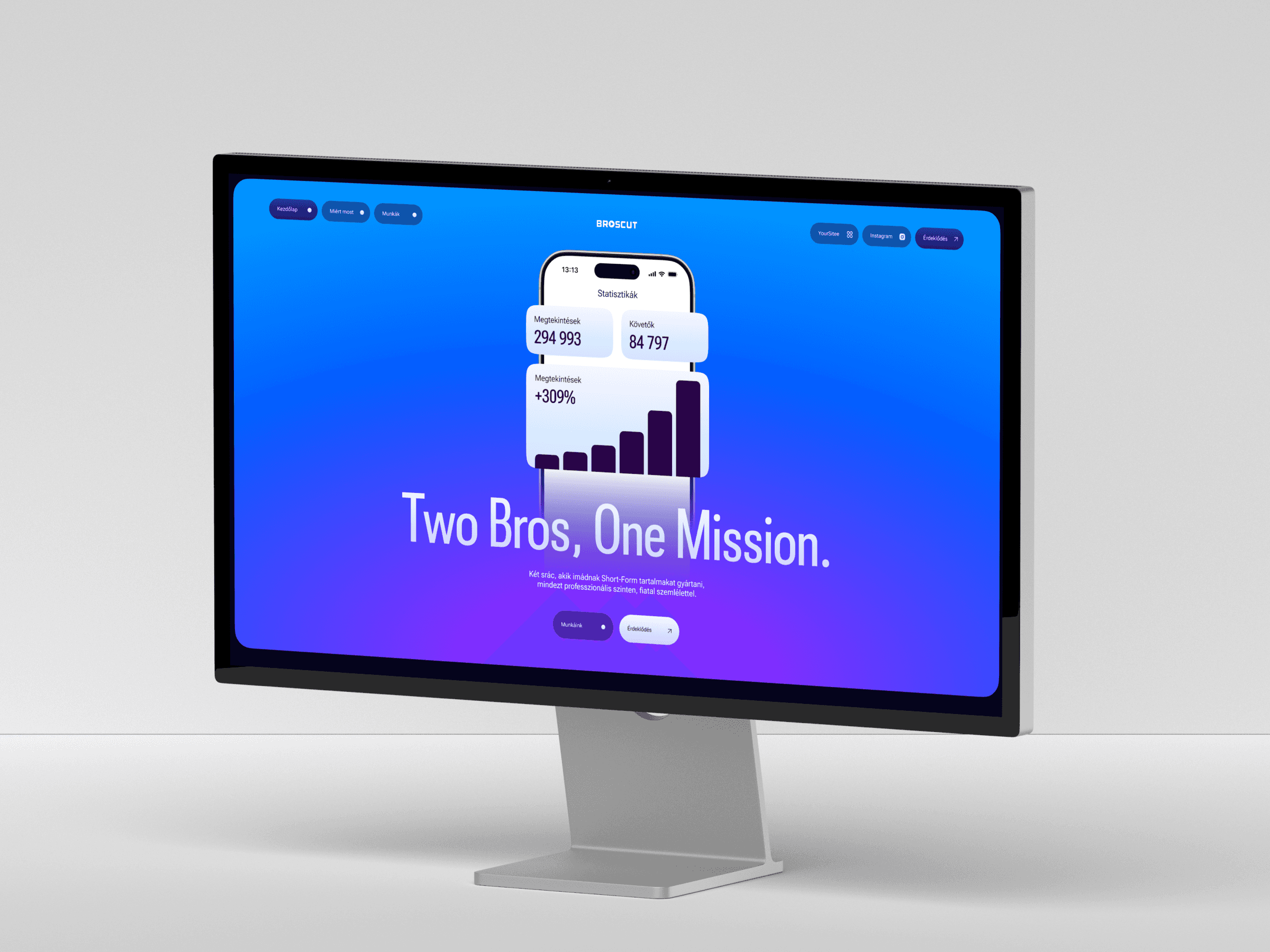
For the landing page, I worked together with another amazing designer. We kept the structure intentionally simple. Large curved transitions divide the sections, creating a natural flow without relying on hard edges or heavy layouts. Instead of explaining every feature through long paragraphs, the interface itself became the hero. Real widgets, real content and real layouts demonstrate what the product can do far better than illustrations ever could.
The result was a complete visual refresh covering the brand identity, color system, typography and landing page.
The new identity feels playful without losing credibility, giving YourSitee something instantly recognizable that can scale alongside the product. The landing page follows the same philosophy. Minimal copy, bold visuals and the interface taking centre stage. Rather than selling the idea of the platform, it lets visitors experience it immediately through the product itself.
Together, the refreshed branding and website create a much stronger first impression while giving the growing platform a visual identity that finally feels like its own.